

10 Ways to Design AI Interfaces for Better Prompting
For most users, prompting an AI is like ordering at a restaurant with no menu — you're hungry, you sort of know what you feel like eating, but you're not sure what the chef can make or how to describe what you’re envisioning.
This is the current experience of many users interacting with generative AI tools, particularly everyday general-purpose ones like ChatGPT, Perplexity, Sora, or Claude where most users have little familiarity with AI or tech at all. Not everyone is aware of the range of their tool’s capabilities. Not everyone can quickly recall the vocabulary to conjure up the best descriptions of what they’re looking for.
In other words, not everyone knows what information their desired output actually needs, how much context to provide, or how to ask for a specific tone, format, or style. That’s one significant reason why not every user is satisfied with their outputs.
If you work with AI products or have created your own, you may have learned best practices for prompting -- which typically include being clear about your intent, specifying constraints (like length, tone, or target audience), and offering context or examples when needed. But for many users, this kind of structured thinking doesn’t come naturally and might even pose a cognitive struggle. Jakob Nielsen, founder of the design organization Nielsen Norman Group, describes this as an “articulation barrier”.
That’s why great UX can step in to provide guidance and ease the friction between human intent and machine output.
Good prompt input design reduces cognitive load, increases accuracy, and improves output quality. But right now, many tools expect users to just "type something in" — and that's like handing someone a blank page when they need a fill-in-the-blanks worksheet.
So, how might we redesign the humble input box to help users confidently create more thorough, more specific, and more successful prompts?
Here are some interface design strategies — inspired by great examples across the industry and this interview with some experienced Toptal designers — that can help you differentiate your product’s usability from the competition.
1. Prompt Templates and Examples: Input Fields Instead of One Big Box
This is especially useful for detailed media or report generation tools where quality prompts are likely to be lengthy and complicated. Predefined fields are one way to ensure your users are providing adequate context by showing them what context your system expects.
For example, AI video generator Synthesia features fields instructing the user to enter their video’s desired language, tone, and audience. Users have the option to provide additional information critical in video production, such as “objective” and “speaker”. This reduces ambiguity and guides users who are totally clueless about writing prompts.
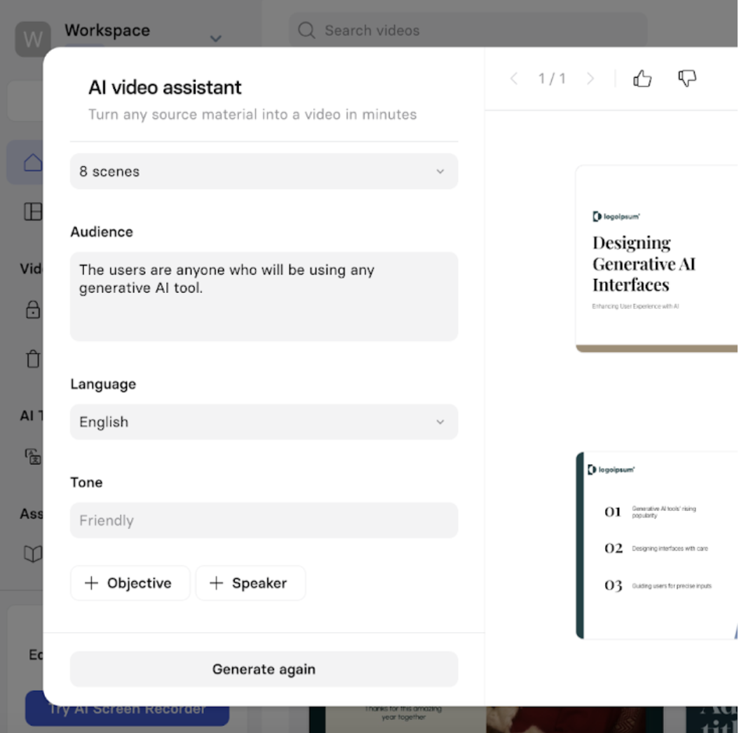
Keeping the extra fields optional and not fully expanded helps prevent the user from being overwhelmed by all the clicking and typing, while keeping them aware of what information the system needs.
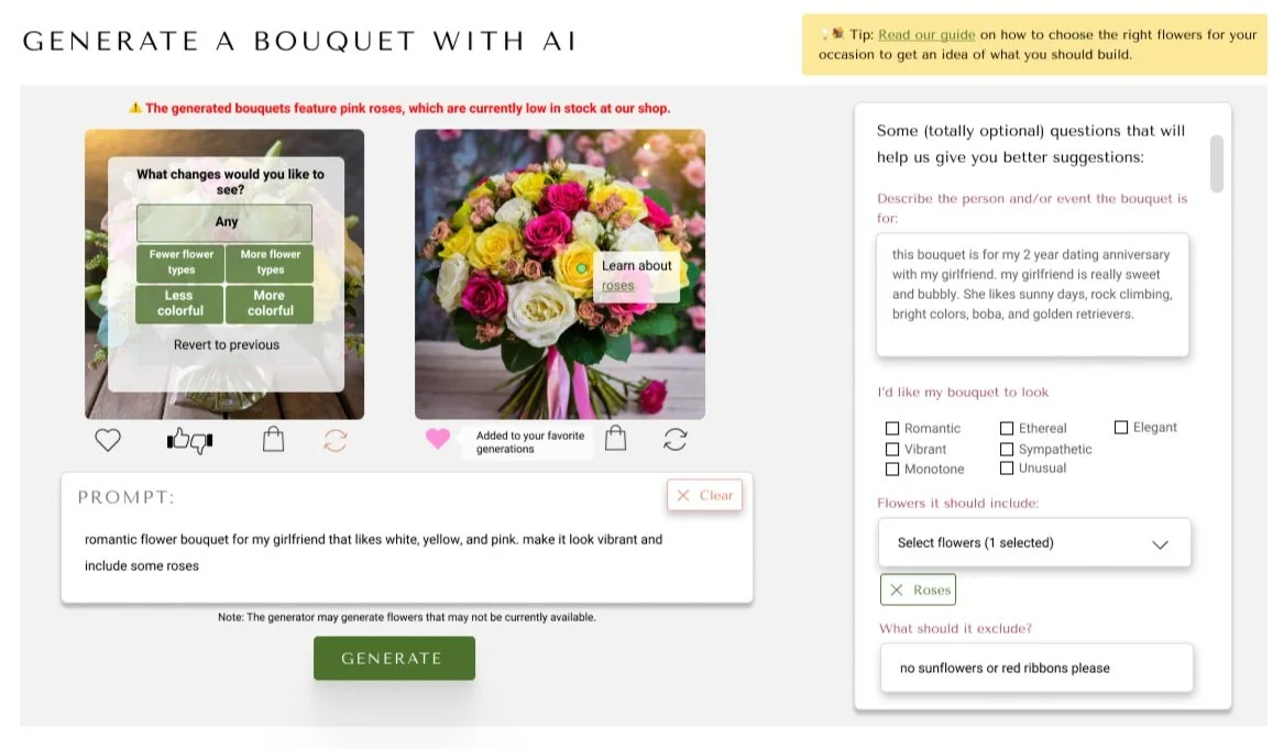
Here’s how I designed an optional prompting worksheet for one of my portfolio projects, an image generator for an imaginary flower shop I created for an online design course. To determine these parameters, I researched the typical thought process in selecting a flower bouquet to figure out what users look for.
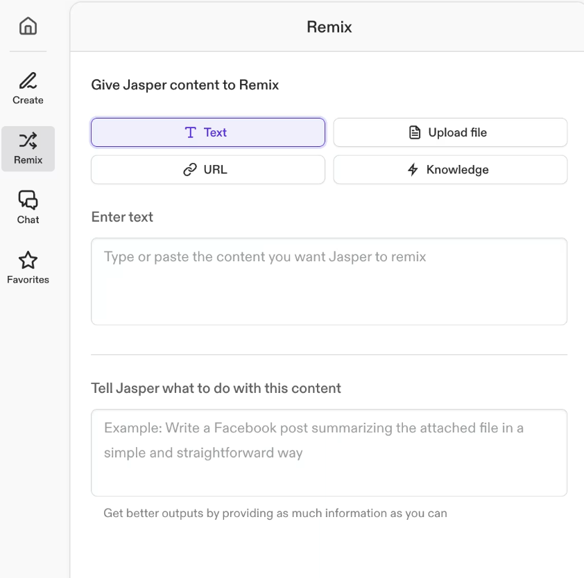
Content generation platform Jasper.ai might attribute much of its success to its several prompt templates and toggles, which provide shortcuts for the user to conveniently refine their desired output without the tediousness of typing:
A simpler, more straightforward design strategy for prompting can just be simple “tell me what to do” instructions with a well-written example in the preset text and brief tips written below:
The least space-consuming version of this is to have parameter tags that light up when the user enters the corresponding information, as you can see on AI recruiting platform Juicebox:
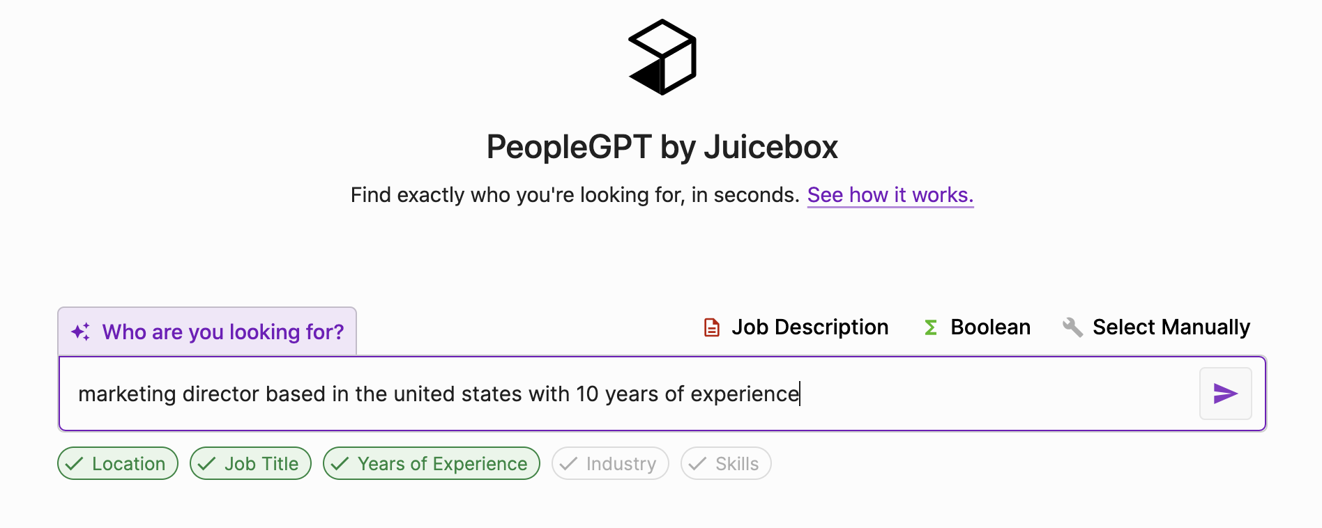
This way, you can inform users what details your system expects without taking up additional space with extra fields or toggles.
This strategy is especially useful for: content generation tools with predictable use cases that require a lot of details from the user, such as Jasper.ai. Like Jasper.ai, you can create multiple templates tailored to different purposes that your product offers. This strategy is also useful for tools like Juicebox or video generation platforms that consistently expect a certain prompt structure, such as location, tone, style, or years of experience.
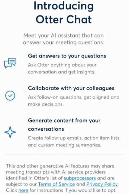
This may not work so well for: very general-purpose tools like ChatGPT, where user input is too unpredictable for templates. For some highly specialized tools, users are more likely to know what they want anyway, such as users of AI meeting agent Otter.ai asking its chatbot for key insights from their 11 AM meeting or why their 2 pm meeting couldn’t have been an email. B2B users are also more likely to have had some workplace training on how to prompt and the tool’s range of capabilities.
For tools like this, it’s probably enough to inform the users what the tool is capable of during onboarding:
Multiple fields may be overwhelming for on-the-go users who need quick results, such as users of AI companions. If your use cases often include both solemn, reflective thought in the office at 1 pm and impulsive questions while partying at 1 am, consider making the prompting template hidden and fully optional so users won’t feel obliged to use it.
➡️ You can read more about prompt templates at Shape of AI.
2. Listing A Few Key Use Cases Before the Input
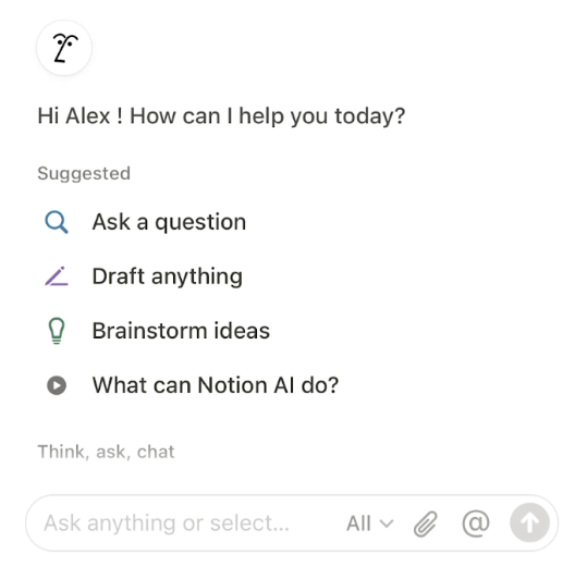
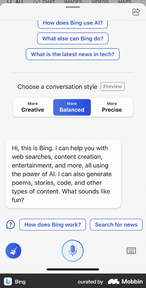
If providing prompt templates is too rigid or tedious for your product’s use cases, you can ask framing questions and/or show a short list of examples of intended use as seen here on Notion:
If you’re creating a generative AI tool for users to write workplace performance reviews, your suggestions might include:
“Summarize this person’s key accomplishments this quarter."
“Rephrase a review to sound more supportive.”
“Write a review for an employee focusing on certain skills.”
If your AI is meant to shapeshift into different personas as ChatGPT can, let your users know. For example, if your product is a bot that helps UX designers ideate, you might want to add a suggestion like “imagine you’re a UX design manager giving me feedback on my latest wireframes uploaded here…” or “imagine you’re a stressed out 60-year-old user who’s using this app while in a hurry…”. (Of course, users should ideally describe these personifications more thoroughly -- you’re just giving them a start.)
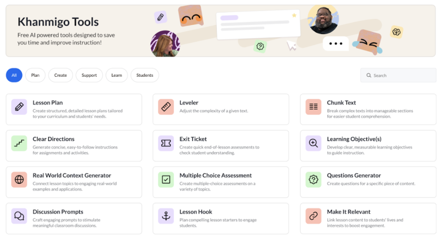
You can also frame these different functions as distinct tools, as pictured here with Khan Academy:
This strategy is especially useful for: multi-purpose tools where users may benefit from guided brainstorming.
This may not work so well for: copilots where the user’s input is heavily dependent on context, such as AI companions. This strategy might work for copilots only if you’re using generative UI to adapt to the user’s context.
3. Providing Example Clickable Prompts
A quick way to get the user prompting is to feature buttons with pre-written prompts that the user can immediately enter into the system with just a click/tap. If the user is logged in and your product uses generative UI, you can tailor the prompts to their account activity.
This strategy is especially useful for: search engine-like tools such as Perplexity or creative assistant tools where new users may not have any particular question in mind, but are curious to explore the tool’s capabilities.
This may not work so well for: copilots and tools receiving deeply personal, emotionally sensitive information such as journaling apps -- especially if the AI is also asking the user questions like Dot. This is because the user’s input is heavily dependent on context, so suggested prompts just aren’t as predictable.
However, this strategy might work in such contexts if your generative UI is on point. With generative UI, these clickable prompts can adapt to the ongoing conversation.
4. Make the Prompts Editable and Refreshable
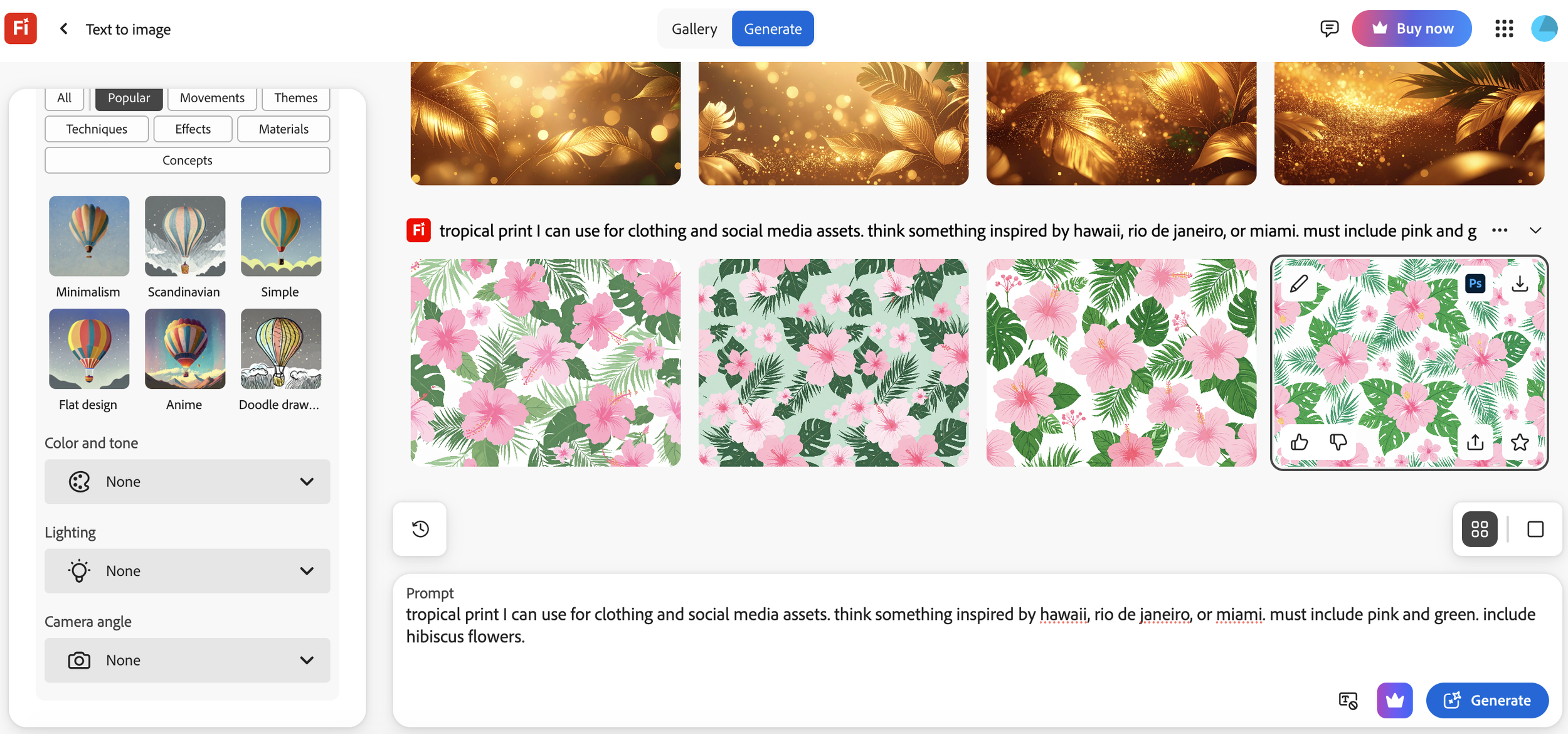
Not erasing the prompt from the text box after its submission can make it easier for users to tweak or regenerate individual parts of a prompt or result. Adobe Firefly retains the user’s prompt in the text box even after the image has finished generating:
A future-forward idea: if you’re building an image generation tool, you could feature a small pop-up that says, "I added this texture because of your word 'gritty.' Want to change it?" Users could respond like a creative director giving feedback to an intern.
This strategy is especially useful for: design and multimedia generators, where iterative refinement is common.
This may not work so well for: one-off query tools and conversational chatbots, where users typically respond with a completely new prompt.
5. Suggest Generative Follow-Up Prompts
If your users often enter distinct but related prompts following their initial submission, consider giving them suggestions.
A content generator tool can drop UI hints like:
"Want to make it funnier?"
"Want to add more intricate detail?"
"Try a different style, such as anime or photorealistic?"
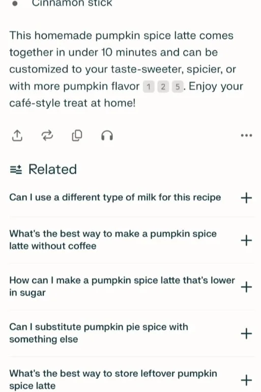
These suggestions keep the session going and help users discover new and useful information related to their original prompt that they may not have initially considered. This is a particularly notable feature of Perplexity that other general-purpose bots tend to lack. Perplexity generates related questions that may be helpful to the user’s original prompt, unleashing valuable knowledge:
This suggested augmentation has frequently helped me sustain conversations with certain friends infodumping about niche interests I know nothing about, such as cars from the 1990s. All I do is pull up the Perplexity mobile app when they’re not looking, ask it questions related to my friend’s infodump of the day, and immediately discover key facts I can mention to appear more cultured than I actually am.
This strategy is especially useful for: conversational AI chatbots and informational tools like Perplexity or Microsoft Copilot, like tools used for research and virtual assistants.
This may not work so well for: transactional tools, where extended interactions aren't necessary. This might also be unnecessary for tools where users are asking questions about certain documents, such as meeting notes or research papers. That is, unless you notice consistent enough patterns in their questioning process.
7. Let Users Save Prompt Templates
If someone's using your tool daily — for reports, social media captions, code reviews — let them save and reuse their best prompts to save them time and repetitive typing. You might want to consider making a separate page for the user’s prompt templates so they don’t have to dig through their old chats. This can conveniently speed up their workflow.
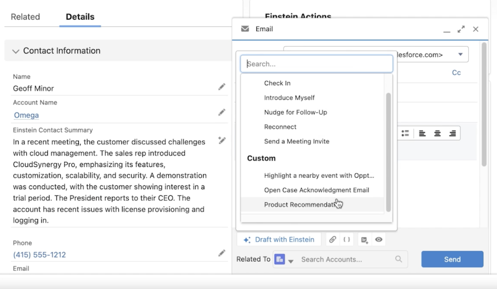
A notable B2B strategy is the CRM Salesforce’s Prompt Builder, which helps users craft a prompt library for a variety of use cases, such as emails tailored to different stages of outreach or customer segments. Users can select which premade prompt they’d like to use from dropdown menus as they use Salesforce’s AI to email customers. Selecting each template generates an email tailored to the customer’s distinct business data, such as their industry and past interactions.
This strategy is especially useful for: enterprise tools, where users often repeat similar workflows and use lengthy prompts.
This may not work so well for: casual or infrequent-use tools, where users are unlikely to use similar lengthy prompts. For multipurpose tools like ChatGPT, you can consider building a section for users to save frequently used prompts if needed.
8. Improve User Prompts Yourself
Don’t want to squeeze in any predefined fields or extra UI around your main text box? You can follow in the footsteps of Copy.ai and let the users choose whether they’d like your system to improve their prompts for them automatically, making it clearer and concise:
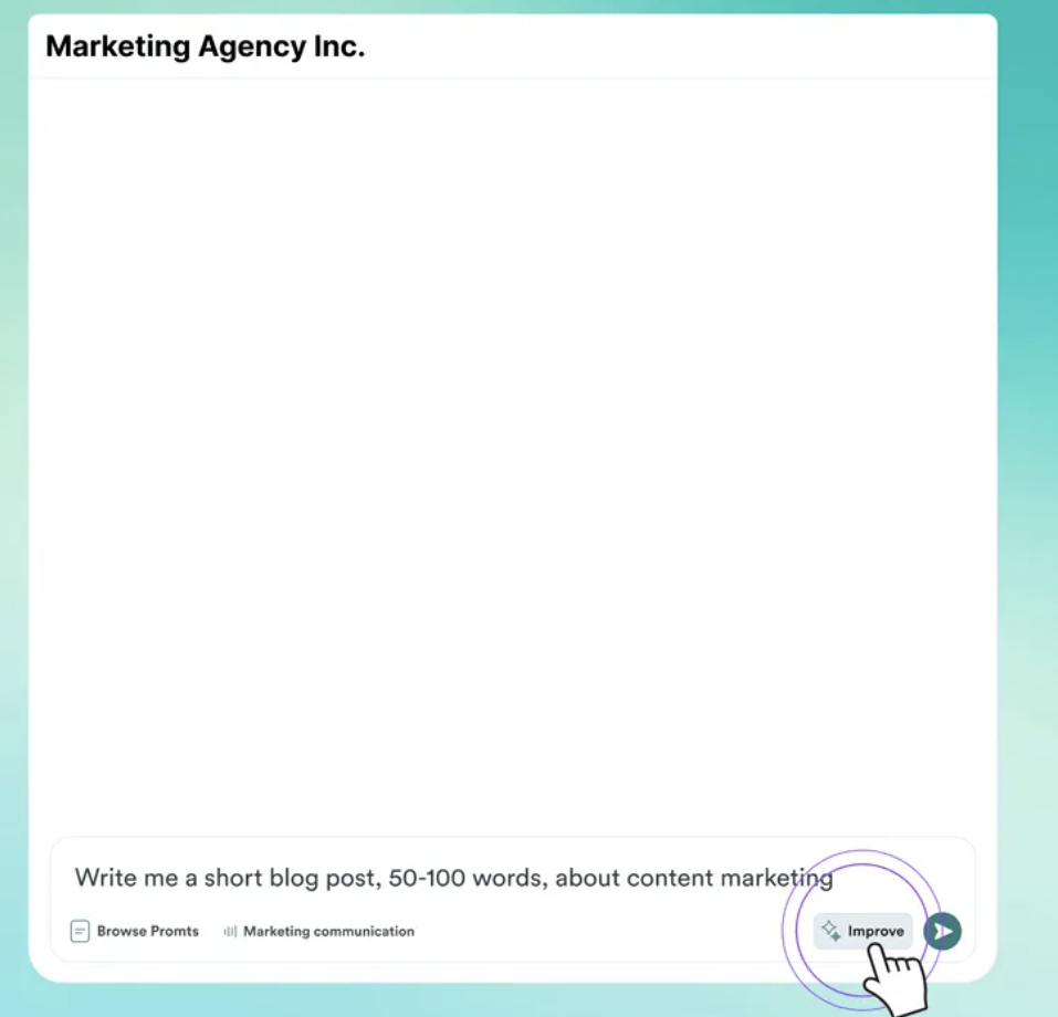
This way, users can discover a more well-written, thorough version of their prompts that can set an example for their future prompt writing.
This strategy is especially useful for: image generators, where users frequently get unexpected visuals due to vague phrasing. Refining prompts before submission can reduce trial-and-error.
This may not work so well for: anything deeply sentimental where even suggesting the user can improve their writing may come off as insensitive, such as an AI companion like Replika where active users are often in a more emotionally vulnerable state and may just want to be heard as they are.
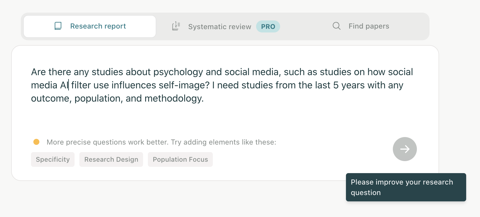
9. Give Their Prompting Real-Time Feedback
Between the rigidity of the aforementioned description input boxes and the vagueness of an “Improve” button is generative UI that suggests how the user can improve their prompt as they’re writing it. You can see that in action with research assistant tool Elicit:
This strategy is especially useful for: tools generally used in a professional capacity such as research assistants like Elicit above, where users are typically sitting down and actually have the time and headspace to refine their prompts.
This may not work so well for: again, anything deeply sentimental where even suggesting the user can improve their writing may come off as insensitive such as an AI diary. If your users usually just ask simple questions, this feedback probably be necessary. If they’re often on-the-go as I was when using Microsoft Copilot on mobile, feedback might feel overly unsolicited or impeding, even if you’re just trying to help.
10. Briefly Explain The Output
You’ve probably had at least one instance of “uh, how did the AI come up with this abomination?! What did I do?”
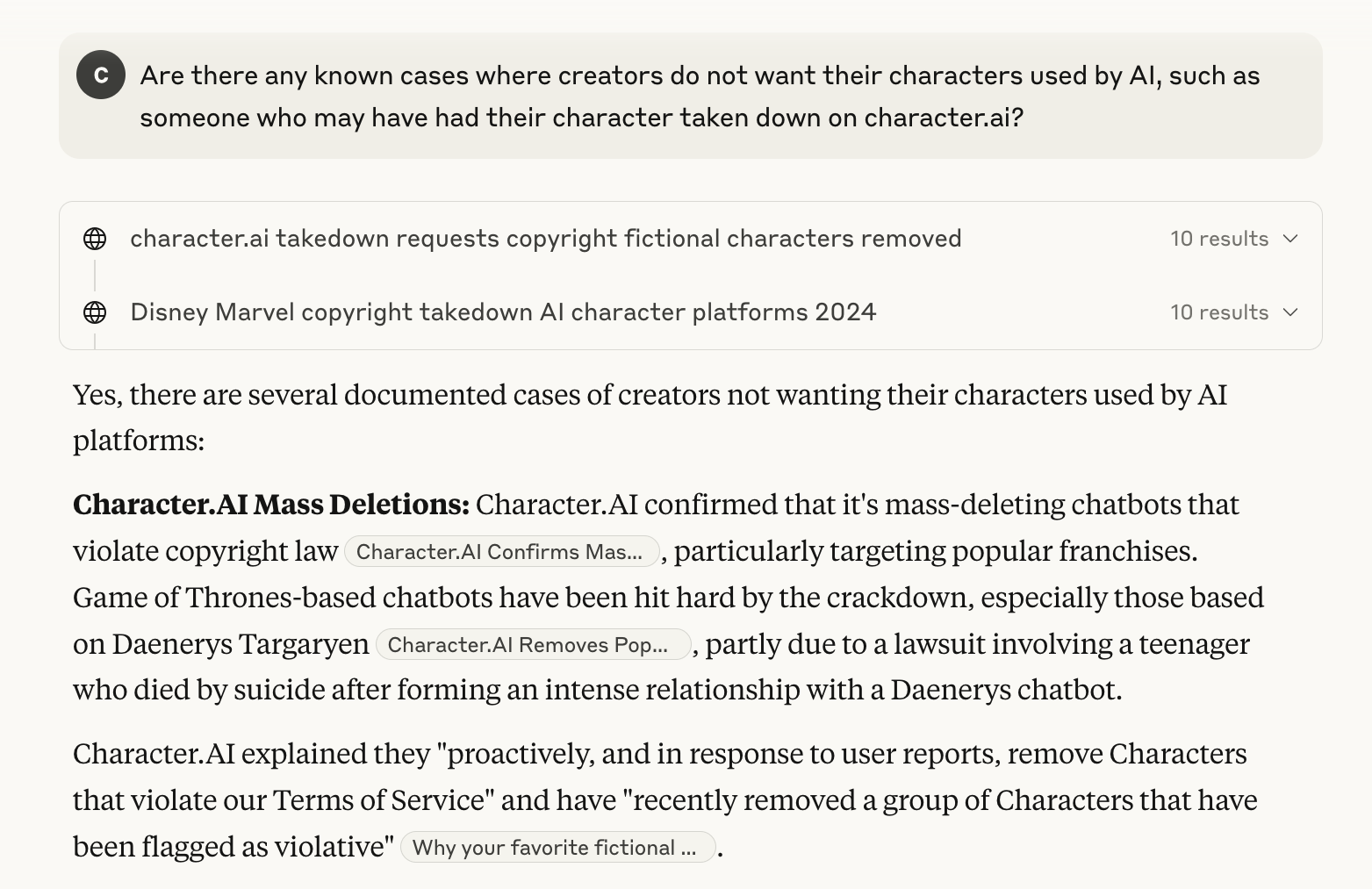
If your users often give vague inputs and frequently iterate, you might consider giving brief explanations of why the tool’s output looks the way it does. This shows the user how your system interpreted their prompts, helping them refine their input while providing transparency.
A common way bots show their reasoning is through clickable citations users can use to quickly verify their outputs, as you can see on Claude:
This strategy is especially useful for: complex output tools, where understanding the behind-the-scenes enhances user trust and confidence.
This may not work so well for: simple output tools, where explanations might be unnecessary.
❗ But wait -- what you actually implement depends on your users
Before copying Perplexity or building a dozen fields into your chatbot, remember: your users aren't their users. Whether the above tips are totally useless or are total game-changers depends on your user behavior and goals.
Use these ideas as inspiration, not prescription. Your final UX choices should be guided by:
Usability testing
Analytics on prompt behavior
Interviews with real users (especially frustrated ones)
The goal is always to help your audience get their desired outputs in less time with less frustration and friction.
Besides convenience, designing for easier prompting is essential for making generative AI tools accessible to a broader range of users. Features like guided questions, modular input fields, visual examples, and editable templates can dramatically reduce the barriers for users who may have cognitive disabilities, anxiety around writing, or limited English proficiency.
By designing interfaces that minimize ambiguity and support recognition over recall, we create experiences that are not only more usable, but more equitable — ensuring that people from a more diverse range of backgrounds can confidently engage with and benefit from AI.