

📅 July 2025 | 👩💻 UX designer/researcher, software developer | 🛠 Figma, Lovable
💼 original product designed and developed for potential investment or acquisition

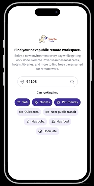
Find a free, public space to work remotely from.
Remote Rover is a tool I designed and developed to help remote workers find free, work-friendly public spaces, particularly cafes, libraries, hotel lobbies, and food courts with reliable Wi-Fi anywhere in the world.
It uses my algorithm and user submissions to identify and curate locations.
Built around Google Maps and Yelp APIs. Designed on Figma, developed on AI coding tool Lovable and polished manually.
😀 Solution: Remote Rover simplifies the search for remote work-friendly spaces by providing a curated, searchable map that displays ALL work-friendly public locations, not just “cafes with wifi”, making it easier to quickly find an alternative space if the cafe of choice is overcrowded.
Intended project impact:
Remote Rover makes it easier for users to discover new, underutilized locations — boosting foot traffic for independent cafes, libraries, and other venues that support remote work. The search results are more accurate than Google Maps due to the community reporting function where users can report an invalid location.
This can have a positive impact on the employers of such remote workers: discovering more suitable environments to work from can support productivity and work-life balance. By surfacing hidden gems and reducing decision fatigue, Remote Rover contributes to a more distributed, accessible, and adaptable remote work ecosystem for all users.

😩 Problem: While searching “coffee shops with wifi” on Google Maps turns up many clearly work-friendly cafes, these results are often inaccurate. Users may also overlook non-cafes that are work-friendly, such as food courts, libraries, and hotel lobbies.

⚠️ Note: the product currently uses partial placeholder data due to high data costs, but the structure is built for scale.
🛣 Current user strategies to find workspaces:
User strategy 1:
📝 Google searches that typically turn up articles like 29 SF Coffee Shops For Getting Work Done
User strategy 2:
🤔 Asking “Favorite cafes to work from?” on discussion forums, group chats, etc
User strategy 3:
The most efficient option in my experience:
📍 Searching Google Maps or Yelp with keywords like “coffee shops with wifi”
➡️
➡️
➡️
✅ Articles provide a deeper level of detail about the location summarized in one place rather than scattered across several reviews.
❌ Their content isn’t always updated and often reflect locations that have closed. Articles typically don’t provide hours or too many photos so you just have to rely on the author’s opinion.
✅ A more diverse range of opinions beyond a few authors and editors. Others can chime in whether a location has closed or with opinions like “no, that place is definitely NOT quiet!”
❌ Many responses are outdated. Respondees don’t always provide hours, photos, or a link to the location’s Google Maps, Yelp, or website so you have to research it yourself.
✅ Mostly accurate, updated results with photos and one review snippet in search results (depicted below) that verifies users find the space work-friendly! 🙌
❌ No way to remove invalid results beyond leaving your own “don’t bring your laptop here” review. There isn’t an easy way to simultaneously display more than one location category, such as cafes AND libraries. So if all the cafes near the user are all occupied, they’ll have to manually search for an alternative.
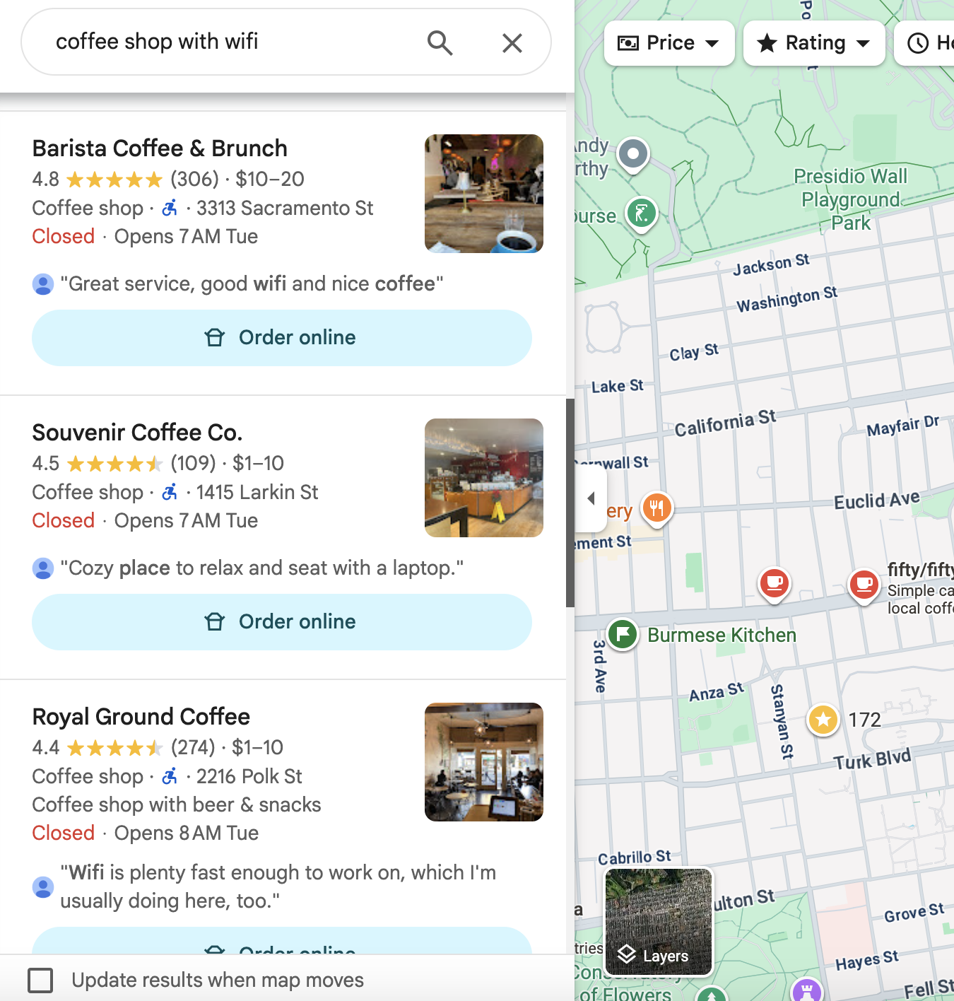
✅ My search results for “coffee shop with wifi” in San Francisco. I can confirm they’re accurate 🙌
(Searching “quiet coffee shop with wifi and food” also turned up mostly accurate results. I’ve also tested this search in international cities for accuracy, such as Bangkok and Mexico City.)
The review snippet makes a major positive impact on usability by providing clear, immediate verification that at least one user finds the space work-friendly.
But what if… ⬇️
That should make it easy to find a workspace, right? Yes, until…
😫 It’s after 5 pm and hardly any coffee shops are open.
😬 All the coffee shops around you with wifi are too crowded.
😱 You picked an invalid result and now you’re at a loud sports bar with a Zoom meeting in 2 minutes 💀

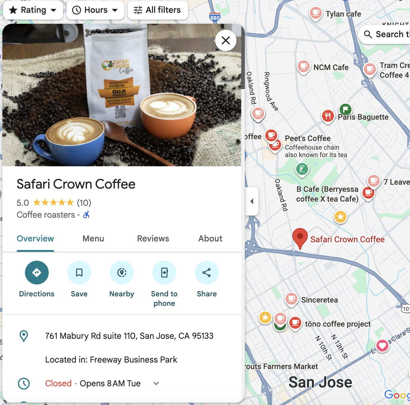
⭐️ This is one of my favorite remote workspaces in San Francisco. But because it’s a food court, it won’t show up if you search “cafes with wifi” or even “places with wifi”.
😠 This means users are missing out on a desirable option!
🕘 It’s also open until 8 pm, later than the vast majority of nearby cafes. This makes it a great fallback if you really need a nearby space after 5 pm.
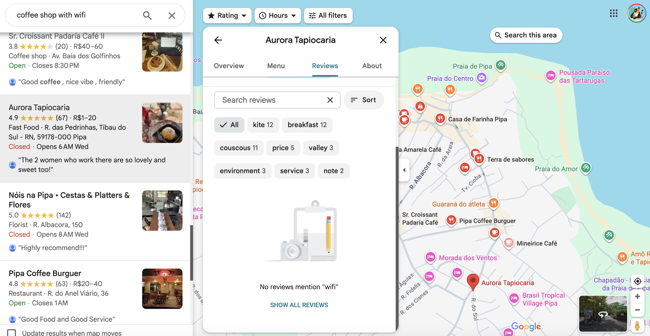
😬 Searching “coffee shops with wifi” in San Jose has turned up far more inaccurate results than in San Francisco.
⏰ Navigating to these locations wastes users’ time and compel users to spend extra time verifying other results.
✈️ Edge case: you’re a digital nomad who decided to go off the beaten path to a lesser-known international location with few tourists or locals who speak your language.
As someone who’s done this, I can confirm this use case turns up a much higher proportion of invalid or questionable results compared to searches in well-known cities across the world.
😫 Because Google Maps isn’t tailored to remote workspaces, you can’t improve these results by reporting them as as “not a work-friendly location” or “this definitely isn’t a coffee shop with wifi”.

😔 Looks like you’ll have to warn users by writing a review yourself.
If only there was an easier, more structured way to classify locations than that…
🕵️♀️ How have other designers solved these problems?
Of course, I looked for whether anyone else had built this concept. There were a few websites and mobile apps, but only three are currently active.
😬 Here’s the first two I found before designing and developing Remote Rover. Upon a heuristic evaluation, I found them very hard to use.
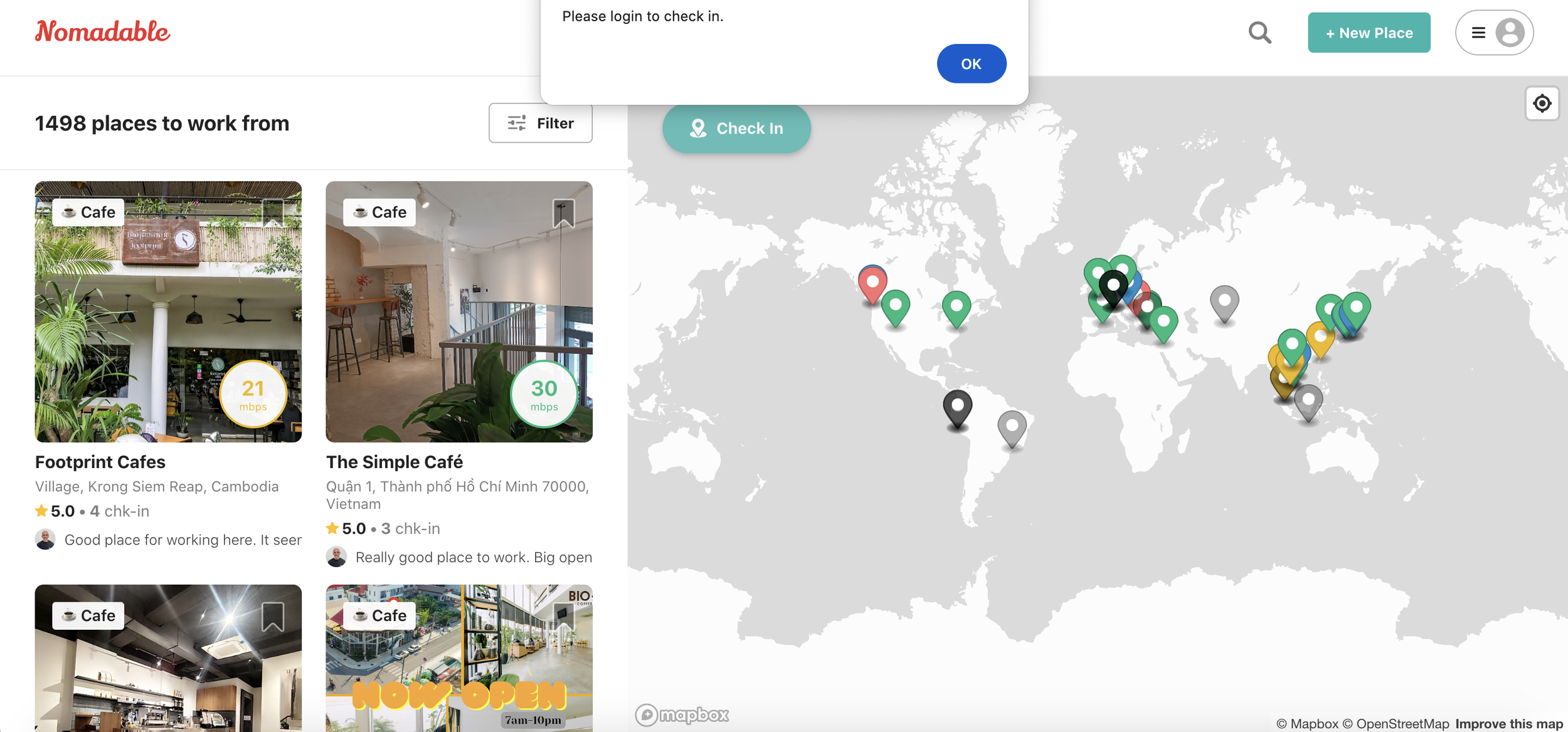
❌ Nomadable immediately opens up with a completely random list of locations in Southeast Asia. (For the record, I’m located in California.) To check in, you have to log in, which you aren’t informed of until clicking the Check In button as depicted. This is inconsistent with the design of most location-based websites such as AirBnB.
✅ Each location features a good quality photo, a label of the place category, and a review snippet of how work-friendly it is, which is consistent with Google Maps.

❌ Remote Work Cafe is only limited to cafes. It’s also based in Greece 🇬🇷 and doesn’t function for locations in the US 🇺🇸 as intended.
🙌 The winner: Laptop Friendly
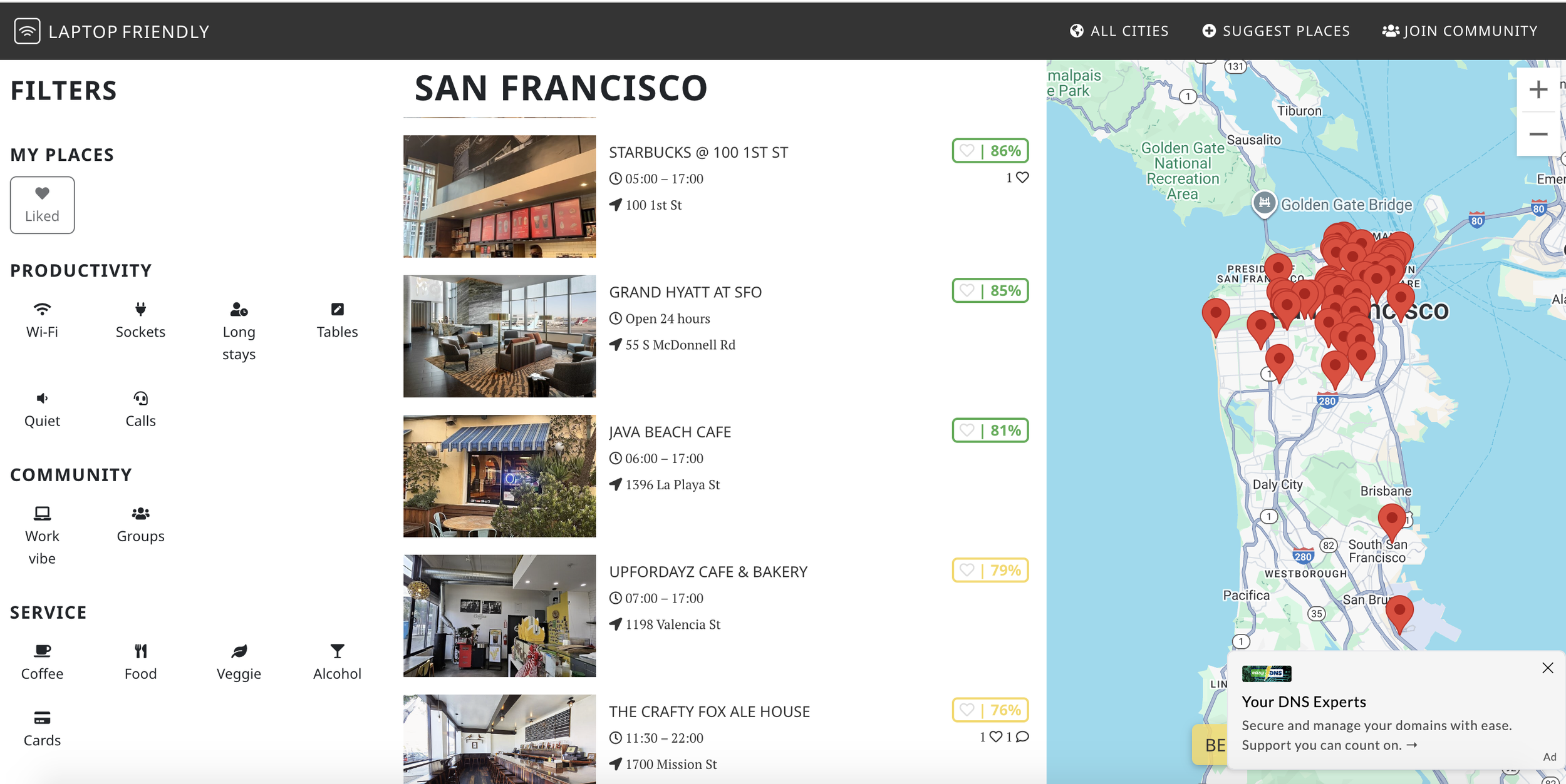
❌ Laptop Friendly is based out of Belgrade, Serbia 🇷🇸 and thus uses the 24 hour clock as you can see above. There’s no way to change it. Just this one feature alone will cause tremendous user friction with my mostly American, San Francisco Bay Area-based users (to start).
❌ It doesn’t label the location’s category: whether it’s a hotel, cafe, etc.
❌ “Work vibe” and “Groups” filter above are unclearly defined.
⚠️ Important note: Heuristic evaluations can’t replace user research. I could not find a substantial amount of information on usability issues other users have had with these sites. I’m currently filling in this gap in my user testing as described below!
✅ Laptop Friendly aggregates work-friendly spots of ALL types, including hotels as depicted above to provide users with more options and variety.
✅ While it pulls data from Google Maps, it also collects its own data to further quantify how work-friendly the location is, giving the users more data to make more informed choices.
✅ Users can also refine results with multiple preset filters on the left, adding user flexibility and reducing time to find the ideal spots.
🤔 So now we know how users find workspaces. What features are they seeking in an ideal space?
To better determine which features to implement beyond the ones depicted by the other websites above, I researched typical remote worker needs and concerns through discussion forums, articles, and Google Maps and Yelp reviews of popular and underrated work-friendly locations.
Example cafe reviews from remote workers:

🤫 Physical environment
A quiet location
Lots of seating available
Aesthetic and ambiance conducive to focus and productivity
Distance to home and public transit
🔌 Technical elements
Strong wifi
Power outlets availability
Space for non-computer work such as reading, writing on paper, or knitting
⚠️ Space policies

Key insights in what remote workers seek:
Can stay for several hours
Wheelchair accessibility
Ease of obtaining wifi password
Late or early closing hours
🍔 Food & drink options
Quality food and drinks
Range of food and drink choices
Affordability
If there’s a bathroom or not
-
✅ As someone currently working remotely, this is an app I and many of my friends would use every week. I’ve worked remotely quite frequently in several states and countries so my experiences with public workspaces is much broader than the majority of my potential users.
✅ I’ve used such workspaces for non-computer and non-corporate work, such as sketching art and writing postcards.
✅ I’ve worked from international destinations where I did not speak the local language and had trouble navigating due to a lack of tourist presence.
❌ The research I conducted above only discussed issues with workspaces themselves and what remote workers value. I could not find very much information on usability issues with actual tools such as Google Maps or Yelp. I’ll account for this in the usability testing described below.
-
This product doesn’t just impact users, but also the businesses who are likely to receive increased traffic.
Taking this into account, I reviewed the potential impact of Remote Rover on business operations as depicted in this discussion from a developer who previously built a similar (currently inactive) website, such as potential business conflict and profitability.
The overall takeaway seems to be that while Remote Rover is likely to increase the amount of patrons who use such spaces without contributing to sales, increasing traffic is likely to lead to greater net profits overall.
🔍 A more in-depth look at our prospective users
I used the information above to put together user personas and a journey map featuring common but diverse user journeys and needs, taking into account a wide range of events contrasting in theme and cultural background.
The main two user personas I designed the user flows around were:
“The Local Regular” — remote workers looking for a local change of scenery from their homes
“The Digital Nomad” — remote workers traveling to other states and countries
Click to expand
The product so far
I designed each screen on Figma and brought it to life on AI vibe coder tool Lovable. The bulk of the code is AI-generated from my prompts and Figma files, but some of it is manually written by me.
✅ More features will be added after substantial usability testing!
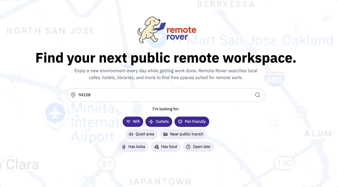
The homepage: a simple location search bar
It seems most efficient that users should be able to search for a location right away upon opening the site — reducing friction compared to the user flows of the competitors above. No need for logging in.
Like on Google, the screen asks the user for permission to detect and fill in their current ZIP, minimizing the time between the user landing on the site and viewing results. The user can use their current location or erase this to enter any city/ZIP.
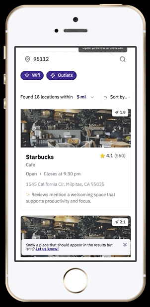
The user can open each location on Google Maps to view the location’s full details and navigate there.
Solving the problem of inaccurate results: human location cleanup
As depicted above, Google Maps’ algorithms and generative AI won’t always be 100% accurate. That’s why users are encouraged to take down inappropriate locations to account for technical gaps, improve result validity, and prevent users from wasting time manually verifying a location or navigating to the wrong location.
✨ All images are from the final developed product, NOT a Figma prototype!
Based on what many users look for in a workspace, I added a few default filters to make it quicker for the users to find such spaces.
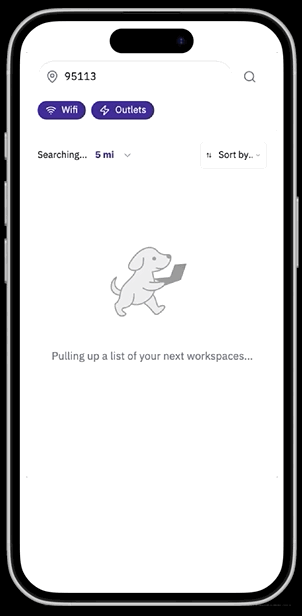
Viewing location search results
The search results and location details panels are inspired by the design of Google Maps.
✨ Each location has an AI-generated summary derived from the location’s Google Maps or Yelp reviews. Each review here summarizes how work-friendly the location is to provide immediate verification to the user so they don’t have to search manually through reviews.
🖼 The photo section provides additional verification by pulling photos of customers working at the location, falling back to photos of seating areas if work photos are unavailable.
⚠️ Note that the photos and AI summaries are currently placeholders as to limit data costs at this time (the location data is being requested from Yelp and Google Maps).
Solving the problem of inaccurate results further: crowdsourcing locations
To account for locations the algorithm may be erroneously skipping, users always see a dismissible floating banner mentioning they’re always welcome to submit a location. Users must confirm the submission has characteristics that make it work-friendly.
✅ This makes lesser-known and brand new spaces (which may lack reviews) much more discoverable, giving users more suitable options compared to Google Maps.
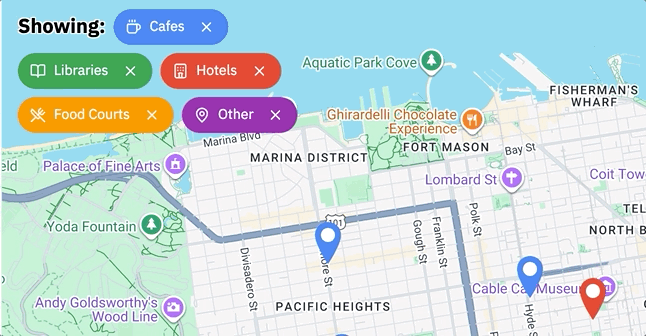
Filtering spaces by location type
Some users may only be in the mood for certain types of work-friendly spaces, such as food courts or libraries. They can remove unwanted categories by removing each tag to refine the results while still maintaining multiple location types.
Each map pin’s color matches the color of each tag depicted for coordination.
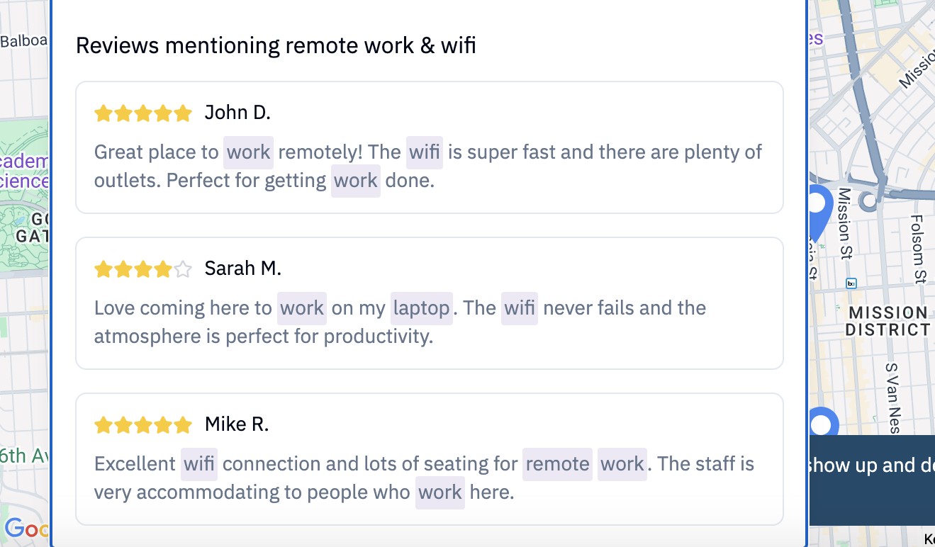
Curated reviews for extra social proof/user trust
Knowing that not everyone trusts generative AI’s accuracy, each location uses APIs and the algorithm to display selected reviews from Google Maps and Yelp from users expressing that it’s indeed work-friendly.
📱Responsive mobile version
It seems like users will most likely be searching for workspaces on mobile — which makes sense that they’d want to wait until actually arriving at the location to pull out the desktop.
The original Figma designs were actually for mobile only. I later edited the code to adapt it to desktop.
Usability testing is in progress!
As of August 2025, I’m currently recruiting a diverse range of participants who often work remotely in public, including students, remote workers, entrepreneurs, and unemployed jobseekers. Testing is in the form of a survey followed by moderated sessions.
1.
Before each session, I’ll share any questions I have with the user about their survey responses.
As mentioned above, I’ll also ask them to review the competitor sites and Google Maps to assess usability issues.
2.
On Remote Rover, the user will be instructed to locate an ideal workspace in their preferred location that they have NOT worked at yet.
3.
I’ll pay attention to whether they have any needs the design currently does not address, such as a filter that isn’t there. I’ll make a note of queries like “is there a way to….” and other struggles.
5.
4.
Since their search results will have some invalid options due to a current lack of user feedback, I’ll ask them to report such options and suggest valid ones with the forms depicted above.
At the end of the session, I’ll ask them how comfortable they are with their decision given the information provided and what other features would make them feel more sure in their selection.
6.
After the moderated session, I’ll ask them how it felt using Remote Rover overall. Would they use this in the future to find workspaces? Would they recommend it to others?
🤔 Next product feature considerations
Since these features are more complex to design and implement, I’m waiting on gathering more usability data in order to make more informed design decisions.
A backend for users to create their own accounts to save their favorite workspaces
Like on Laptop Friendly, user-generated ratings independent of Yelp or Google Maps data for how work-friendly the space is, such as noise level or outlet availability
Personalized recommendations based on the user’s saved locations and their past ratings
Trip planning mode: a section for users to save locations exclusively for a planned trip elsewhere

From my saved places on AirBnB. Imagine this, but for workspaces!